Combo chart
Last updated
Last updated
Availability:
Summary view - All modes except for Transaction and Total.
Focused view (when you select and focus on items in a dimension) - Variance and Stream mode only.
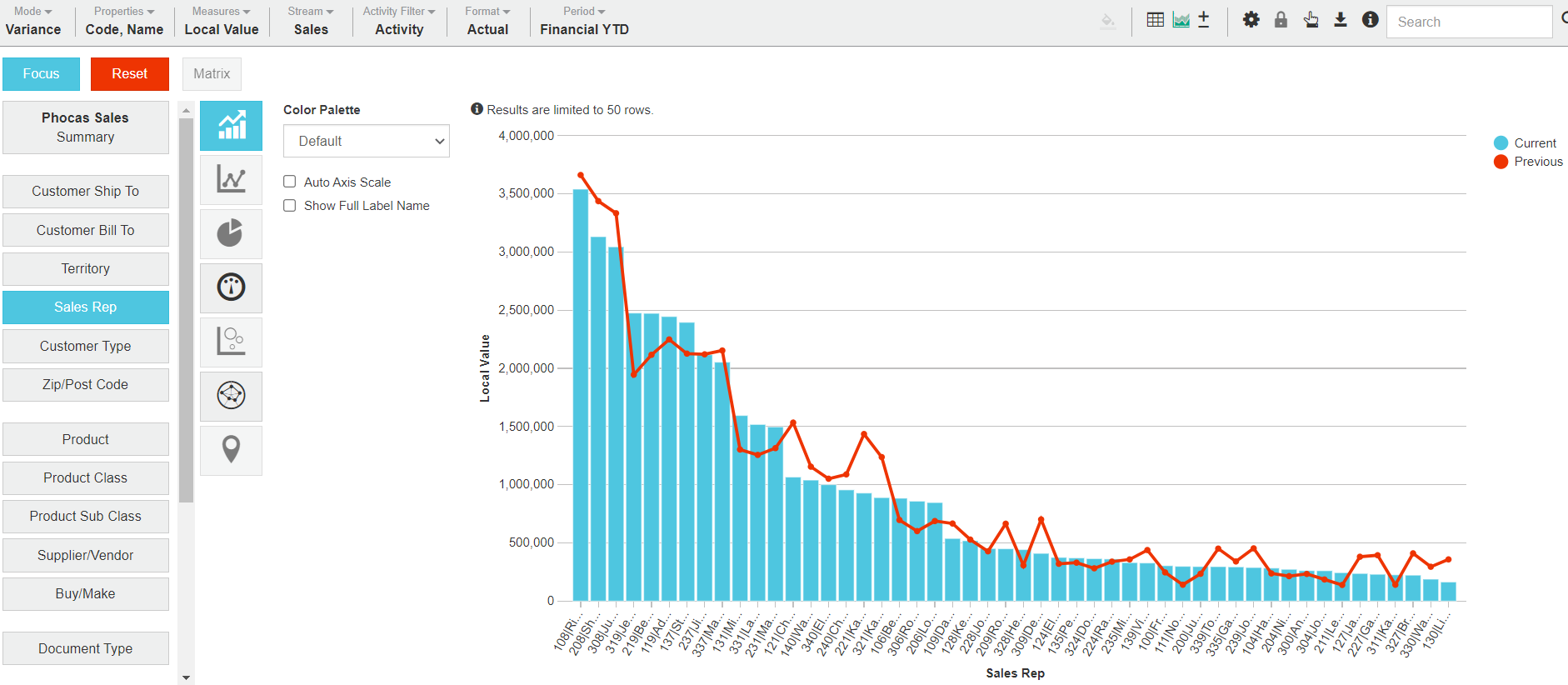
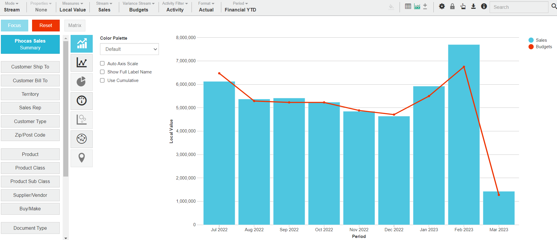
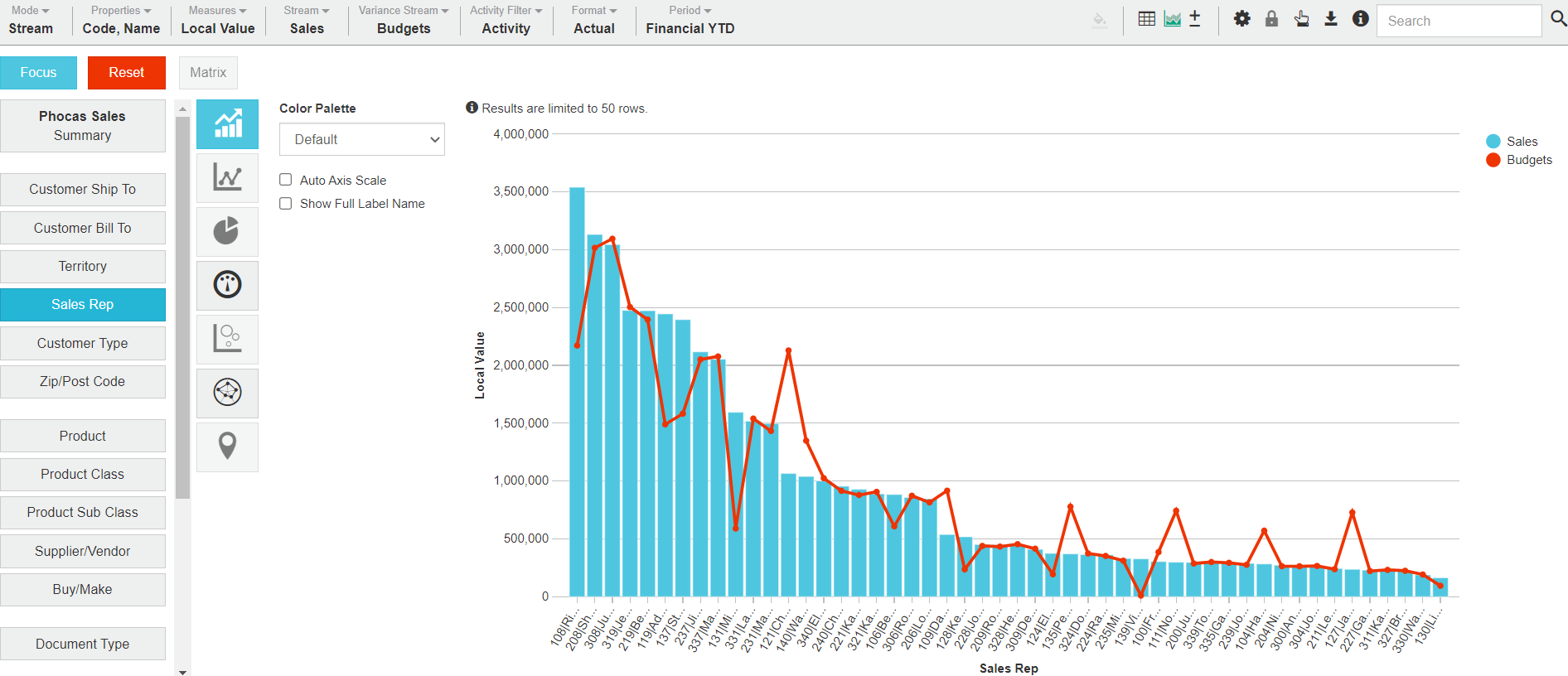
A Combo chart is a combination of the Column and Line charts. One data set, such as a period or stream, is represented by blue columns (bars) and the data set variable is represented by a set of red points connected by straight lines. The use of different elements (bar and line) makes it easier to visualize two distinct sets of data.
Combo charts are useful for simple comparisons involving more than one data set, such as different years. For example, you might want to compare sales against the budget or the performance of Sales Reps this calendar year to date (YTD) against last calendar YTD.
The following table describes what the Combo chart looks like in each view.
Summary view
Focused view
Contents
There is a blue column for the current period (or stream) and a red line for the previous period (or other stream).
There is a column/line for each of the focused items.
X-axis
The X-axis displays the time units of your current period.
The X-axis displays each focused item.
Y-axis
The Y-axis displays the total, which starts at zero.
Example
Related pages
You can take the following actions with your chart:
Configure the chart options | Select and focus on a chart segment | Use the chart legend | Save the chart as a favorite | Add the chart to a dashboard | Export a chart as an image
See also the main page: Visualize your data in a chart