
Create a Value card
The Value card is available in Financial Statements only. This type of chart replaces the value widget that was previously available via the right-click > Visualize option in a financial statement (when the Columns > Periods > Off option was selected).
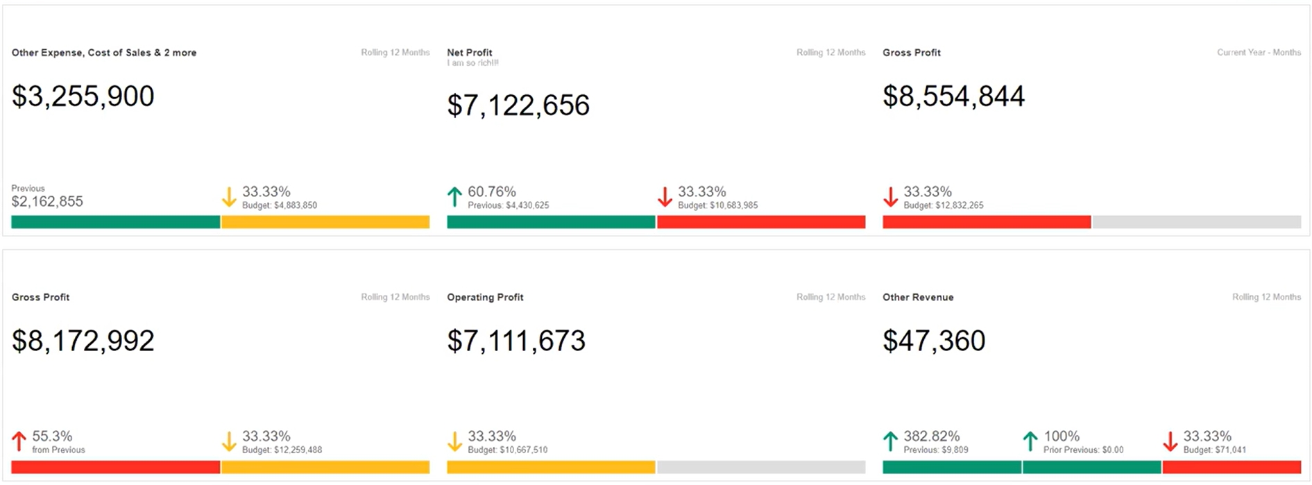
The Financial Statements Value card is similar to the Analytics Summary chart. It displays a value on a card, along with this additional information:
The selected period (top right corner).
The variance with comparison data from one or more streams.
The Value card is suitable for displaying large numerical values, such as your Gross Profit, Revenue, or other key metrics. By default, a grey bar displays at the bottom of the card but you can apply conditional color formatting to use it as a clear visual indicator of performance. For example, you can set the bar to be red or yellow until a target is met or exceeded, at which point it will turn green. The image below has some examples of the Value cards you can add as widgets on your dashboard.
Open the chart pane and select the Value card chart type. See View financial information in a chart for detailed information.
Customize the default Value card to suit your needs. What you can do exactly depends on the setup of the underlying financial statement, such as the period and columns that are selected.
Title: Change the default title to something more meaningful.
Description: Enter a description of the card or use this area to add commentary about the financial information, for example, “in line with prior year”.
Prefix and Suffix: Add additional details before (prefix) or after (suffix) the current value on the card. For example, you might want to add the currency before the value, such as USD $27,984,894.
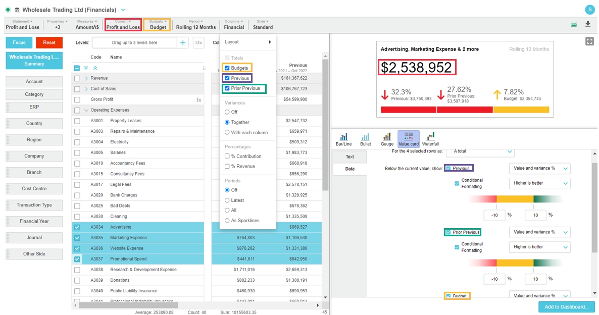
(Optional) Add the card to a dashboard.
Was this helpful?