View budget information in a chart
Visually explore and interact with your budget information in a chart format.
User permission: Budgets & Forecasts
The chart builder tool, available in several modules, allows you to visually explore and interact with your data in dynamic charts.
Charts are available in four budget workbook tabs: Main (budget), Balance Sheet, Database (driver) and Manual (miscellaneous). Charts are particularly useful when the budget grid has a lot of period columns and you are only interested in one or a few budget items (rows). Rather than scrolling across multiple columns, you can visualize the row(s) instead.
Create a chart
While you can select rows in the worksheet before you open the chart panel, only some of the rows (those at workflow level) are available for selection at that stage. When you open the chart pane, you get more row selection options.
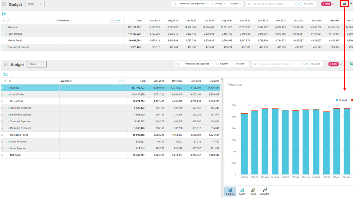
Click the green Chart button in the toolbar. If you had any rows selected, that data displays in the chart, otherwise, you get a message telling you to select one or more rows.

Configure the chart
Switch between different types of charts and configure how the data displays in each one. As you try out the different options, the chart updates accordingly. This interaction helps you find the chart type and configuration combination that best meets your needs. You can change the chart type, the data and text that displays in the chart, and the layout of the chart's contents.
The following information is for the chart builder tool that's available in several modules. You might not see some of the options listed below because the available chart types and configuration settings depend on the module you're using.
Type
Click the chart buttons to switch to a different type of chart, such as Bar/Line, Bullet, Gauge, Pie (Donut), Value card, and Waterfall.
Data
The Data tab is open by default and the available options depend on the selected chart type.
For the selected row(s)
Available when multiple rows are selected, in all charts except for Pie charts, this setting allows you to determine how to treat the values in those rows. The count of the selected rows is specified in the label.
The following options are available for all chart types:
A total: (Default option) Display the values in the rows as a total in the standard chart format.
An average: Display the average value of the rows in the standard chart format.
The following options are available in In Bar/Line charts only:
Stacked bars: Display the data for the individual items stacked on top of each other, in one bar. When you hover over a section of the stacked bar, that item is highlighted and its data displays in a tooltip. This option is useful when you want to compare the relative contribution of items, such as accounts or counties, over time.
Separate items: Display separate bars for each of the selected items, grouped by period. When you hover over a bar, that item is highlighted, and its data displays in a tooltip.
Stacked charts: Display the data for the selected items in separate ‘charts' within the one chart. The charts are synchronized, so when you hover your mouse over an element in one chart, the same element in the other charts is also highlighted. This option is useful when you want to compare items that have a dependency. For example, if you want to compare the performance of the Revenue, Cost of Sales and Gross Profit accounts across the financial year. Stacked charts look great in full-screen mode when you are making presentations and they work really well when you are viewing the information in a matrix format.
Chart this/these columns
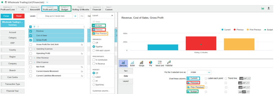
Determine the data streams that display in the chart for the selected row(s). The available options depend on the columns that are in the grid.
In Bar/Line charts, each data stream is selected by default and therefore, displays in the chart. Clear the checkboxes of the streams you don’t want to include.
In the other charts, the Current data stream is selected for you by default. Select a different stream as required.

Label each point
Add label data points to the data streams. This setting is available when you enable a data stream to display in the chart (above setting).
In Bar/Line charts, select the checkboxes of the data streams for which you want to add a label.
In Bullet, Gauge, and Waterfall charts, select the Label each point checkbox, then select the required value from the list.
Trend line
Add trend lines to the data streams. This setting is available when you enable a data stream to display in the chart (above setting).
Compared to
Select the comparison data stream and either:
Leave the default option All the same color selected.
Use conditional formatting to determine when a value is a better result (Higher is better, Lower is better or Closer is better) and enter the percentage parameters. The color coding helps you to quickly identify is a value is good or bad. For example, the more revenue you have the better it is, so if there is a 10% increase in the revenue value it displays in green, if there is a 10% decrease it displays in red and if there is any other movement within the 10% range it displays in yellow.
Color scheme
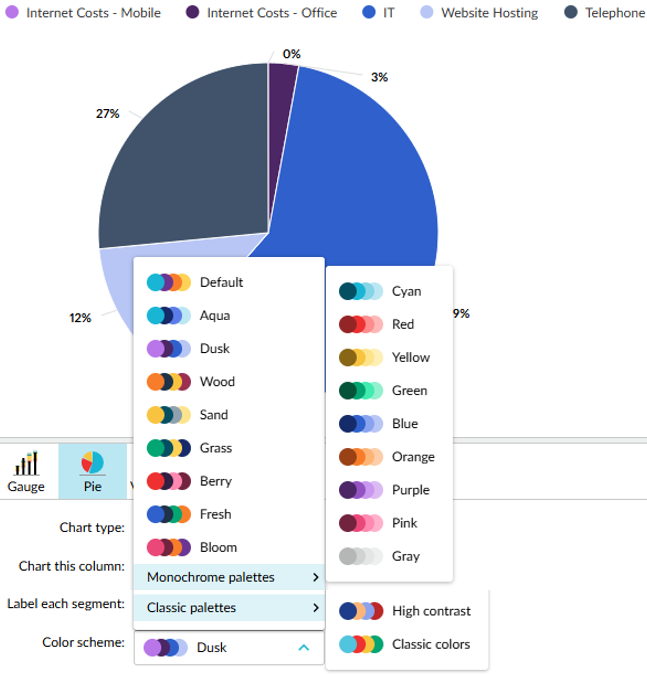
Select the color scheme that applies to the chart.
The Default palette doesn't include traffic light colors. This is a good option for charts with conditional formatting, such as value cards, as the traffic light colors stand out better on dashboards.

Color for totals
In Waterfall charts, select the color for the Total column: Classic (default light blue), Grey, Blue or Purple.
Text
On the Text tab, you can edit the default title. You can also add a description of the chart, which displays as a subtitle. You can use this area to add commentary, for example “in line with prior year”.
Layout
On the Layout tab, you can:
Switch between a vertical (default) or horizontal layout of the bars in the chart.
Allow non-zero scale in the chart. When selected, this setting takes off the zero scale, to highlight the differences or emphasize trends. Not available in the Waterfall chart.
Change the location of the chart legend. By default, it displays in the top right corner but you can move this to the right of the chart or remove it altogether.
Interact with the grid and chart
As the chart builder sits to the right of the grid, you can view the data in two formats at the same time and interact with them simultaneously. For example, you can take the following actions:
Scroll across the grid to view the data on the far right whilst keeping the chart in view. If you want a better view of the grid and a minimal view of the chart panel or vice versa, click and drag the divider to the left or right as required.
Select one or more rows in the grid and the chart will update accordingly. The chart’s Data tab gives you options for dealing with multiple rows.
Click an item in the chart legend to remove the corresponding data from the chart, then click the legend item again to display it in the chart. For example, if your chart displays the budget values for three countries, you might want to remove one, so you can compare the other two more easily.
Edit the values in the grid and the chart will automatically accordingly. You row selections are retained.
Last updated
