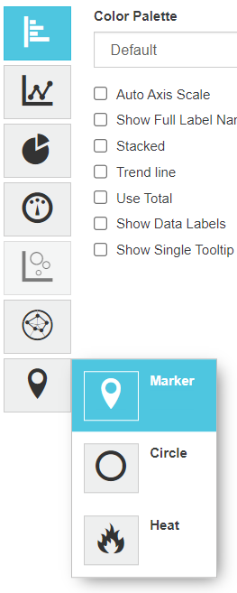
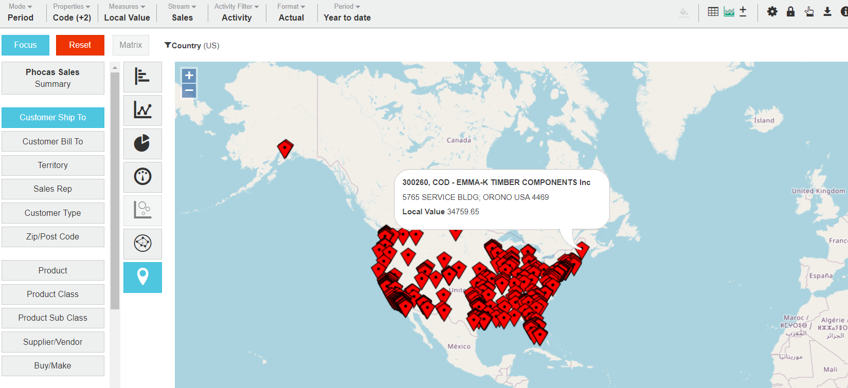
A red 'pin' marker is placed at the address.
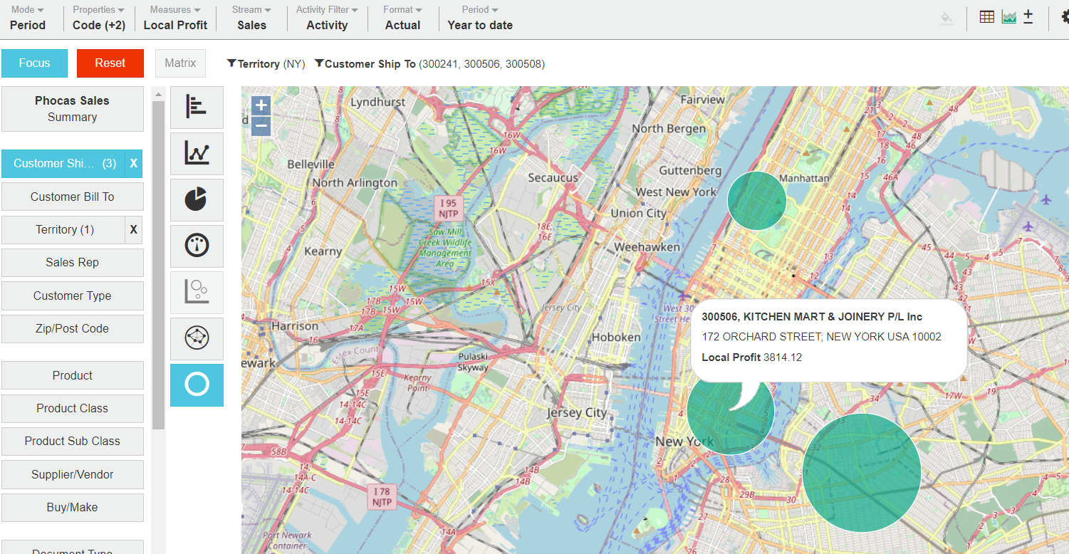
In the example, the locations of three customers are marked in New York's Manhattan region.
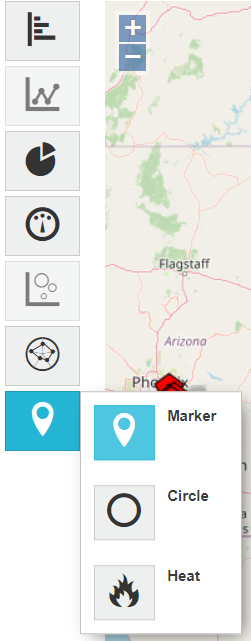
A circle or dot is placed at the address. The size of the circle represents the total. The larger the circle, the higher the number.
In the example, a customer in lower Manhattan has the highest sales.
A heat map is created around multiple addresses. The hotter the color (heading towards red), the higher the number in that general vicinity.
There are two options:
- Count - based on the number of records.
- Sum - based on the sum of the value of those records (for example, the total sales)
In the example, there is a lot of activity on the US west coast, as well as in the south.


 If using individual properties, map charts recognize properties with the following names:
* anything beginning with 'add', e.g., 'Address 1', 'Addr 2', 'Add Del 1'.
* 'city'
* 'suburb'
* 'postcode'
* 'post code'
* 'zip'
* 'zip code'
* 'zipcode'
* 'state'
* 'country' \* *(see administration note below)*
* 'latitude'
* 'longitude'
It is important to have clean address data for best results.
If the data all belongs to a single country, it is recommended that the 'DefaultCountry' system setting is used instead of the country being supplied by a mapped property.
The country 'AUS' does not map. Use 'AU' or 'Australia'.
See [Design a database](https://docs.phocassoftware.com/analytics/visualize-your-data-in-a-chart/broken-reference) and applicable internal documentation.