Waterfall chart
Availability:
Summary view - Period mode only.
Focused view (when you select and focus on items in a dimension) - Variance mode only.
A waterfall chart gives you a visual overview of positive and negative changes to a value over a period of time. It is often used to gain insights into key processes within an area, such as inventory. It is also used to assess financial performance, for example, to build a step by step picture of growth or decline in cash flow. The benefit of a Waterfall chart over a Bar or Column chart is that you get to see each piece of the puzzle (see comparative images below).
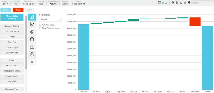
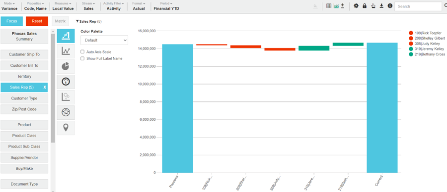
The following table describes what the Waterfall chart looks like in each view.
Summary view
Focused view
Contents
The first (left) column is always 'previous' and the last column (on the right) is always 'current'. These columns show the sum of values for the respective period, including any filters you have applied on the grid.
For the columns in the middle, columns with positive values start at the height of the previous columns and go up proportionally to the variance; columns with negative values start at the height of the previous columns and go down proportionally to the variance. These also include any filters you have applied.
X-axis
The X-axis displays the time unit (month/day/year) of your current period.
The X-axis displays each focused item.
Y-axis
The Y-axis displays the total, which starts at zero.
The Y-axis displays the total, which starts at zero.
Example
Example: Create a Waterfall chart
In the Sales database, create a Waterfall chart to get a visual overview of results for the quarter Oct-Dec 2022, compared with the same period in 2021.
Prepare the data in the grid: In Period mode, in Summary view, apply a custom period for the October to December quarter.
Click the Chart button in the top right toolbar above the grid.
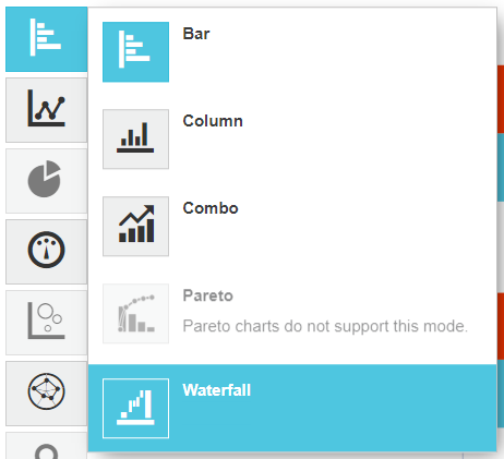
Click the Bar chart category button on the left of the chart and select the Waterfall option.
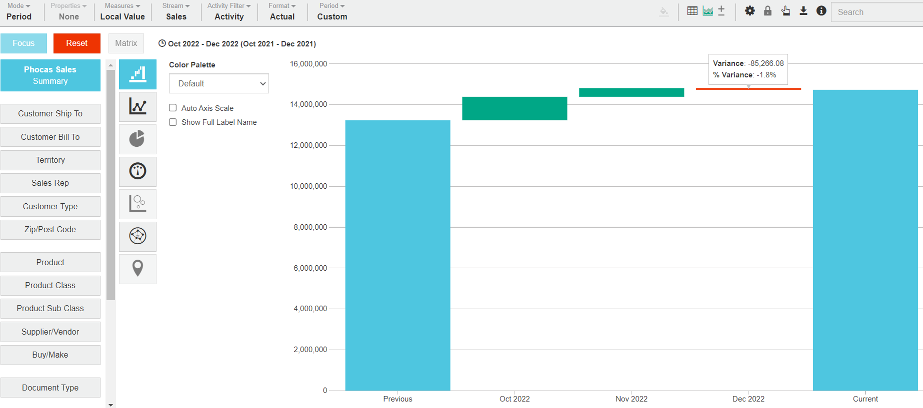
Hover over the columns to view the details. In this example, there was a 1.8% decline in revenue in December.
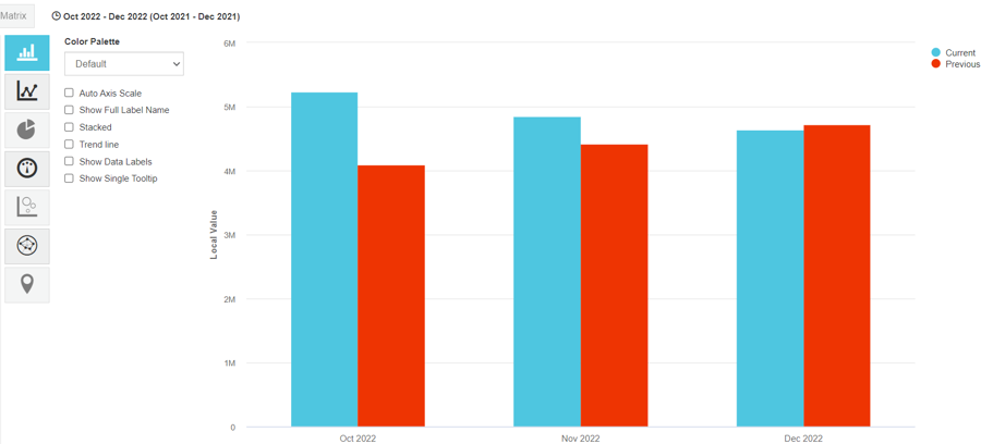
If you view the same data in a Column chart, you can see how the Waterfall chart provides a clear picture of what’s happening.
Related pages
You can take the following actions with your chart:
Configure the chart options | Select and focus on a chart segment | Use the chart legend | Save the chart as a favorite | Add the chart to a dashboard | Export a chart as an image
See also the main page: Visualize your data in a chart
Last updated
