Area and % Area charts
Last updated
Last updated
Availability:
Summary view - All modes except for Transaction.
Focused view (when you select and focus on items in a dimension) - Period and Moving mode only.
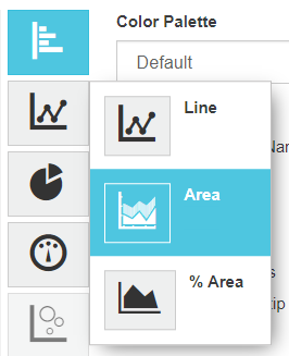
Area and % (Percentage) Area charts are very similar.
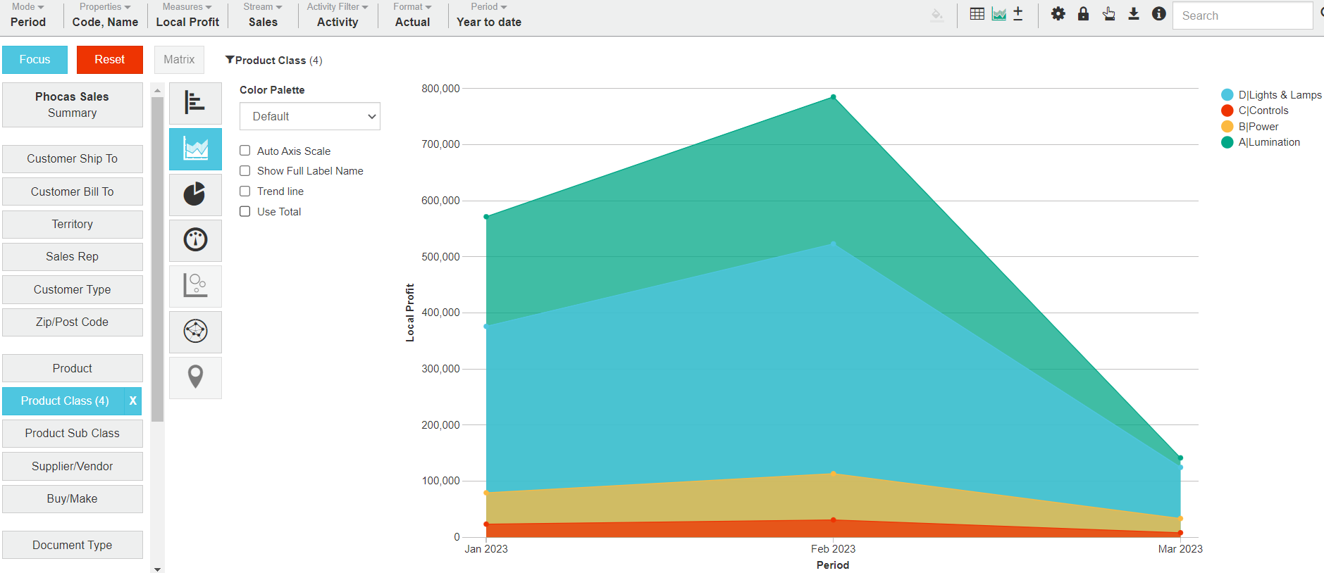
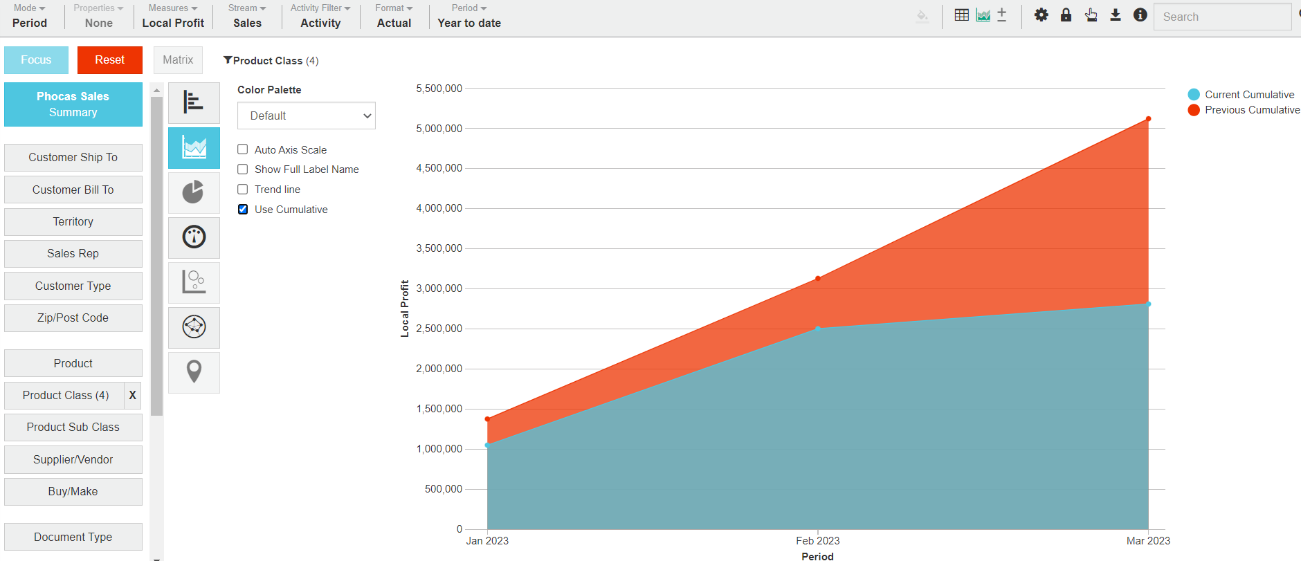
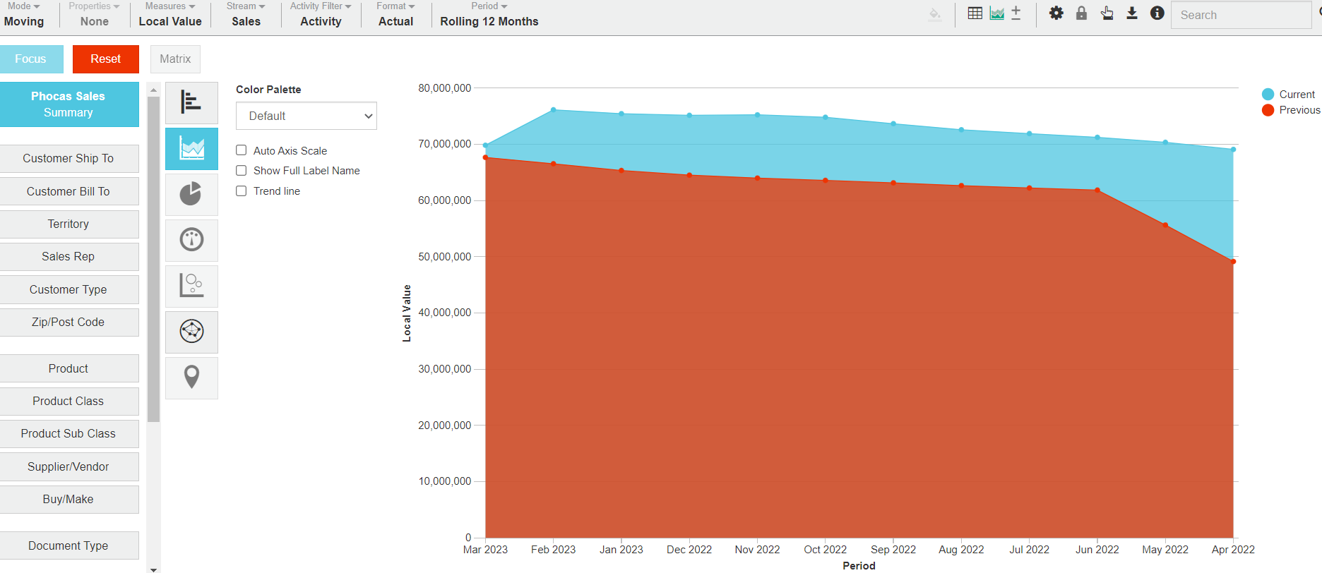
An Area chart plots performance over time, displaying data as a shaded ‘area’ that falls below a set of points connected by straight lines. Area charts are good for visualizing comparisons, for example, using two color-coded shaded areas to display this year vs. last year’s sales, or the value of sales vs. orders.
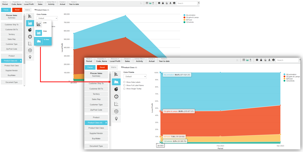
A % Area chart is very similar to an Area chart, however, the shaded areas are based on percentages rather than amounts (the Y-axis displays the percentage from 0 to 100% rather than the total amount). % Area charts provide a different way to view the proportional areas. They also have the benefit of tooltips showing the values in percentage form, which display when you hover over the data points.
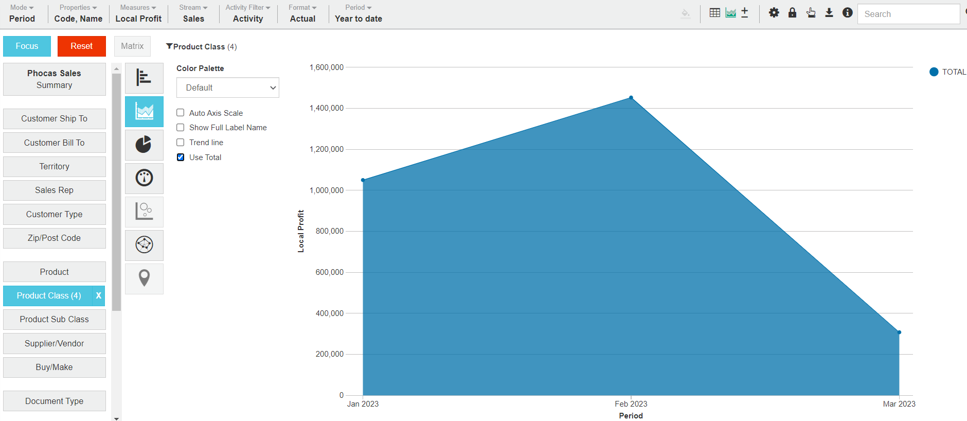
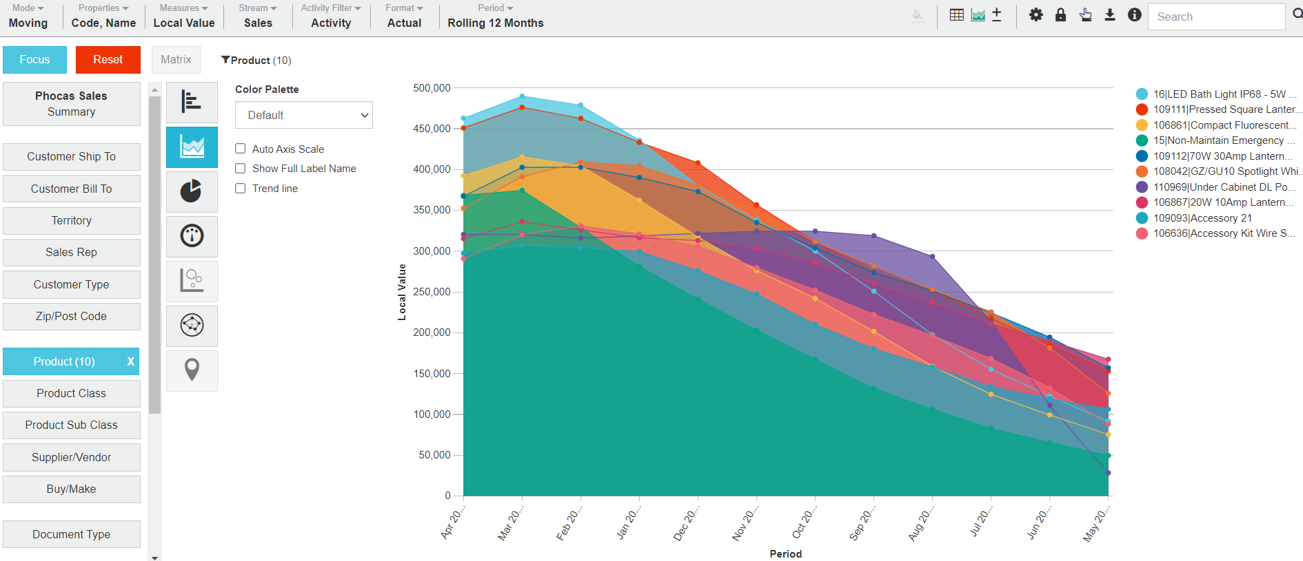
The following table describes what the Area chart looks like in each view. The % Area chart behaves in the same way as the Area chart but it provides a different way to view the proportional areas, as the Y-axis displays the percentage from 0 to 100% rather than the total amount.
| Summary view | Focused view |
Contents | There is a blue area for the current period (or stream) and an orange area for the previous period (or other stream). | There is a colored area for each of the focused items. |
X-axis | The X-axis displays the time units of your current period. | |
Y-axis | The Y-axis displays the total amount, which starts at zero. | |
Example |
Related pages
You can take the following actions with your chart:
Configure the chart options | Select and focus on a chart segment | Use the chart legend | Save the chart as a favorite | Add the chart to a dashboard | Export a chart as an image
See also the main page: Visualize your data in a chart