Bar and Column charts
Last updated
Last updated
Availability:
Summary view - All modes except for Transaction mode.
Focused view (when you select and focus on items in a dimension) - All modes except for Search, Transaction and Market.
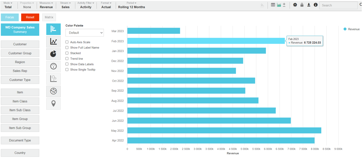
Bar and Column charts are very similar. They're great for displaying simple comparisons. For example, the top 10 product sales or monthly output. You can hover over data points to display the underlying values.
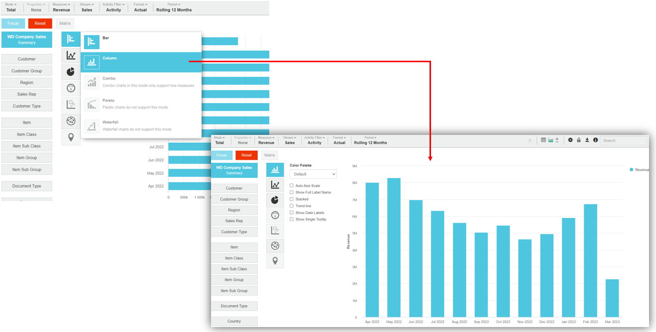
A Bar chart displays several variables together in horizontal bars, whereas a Column chart displays them horizontally.
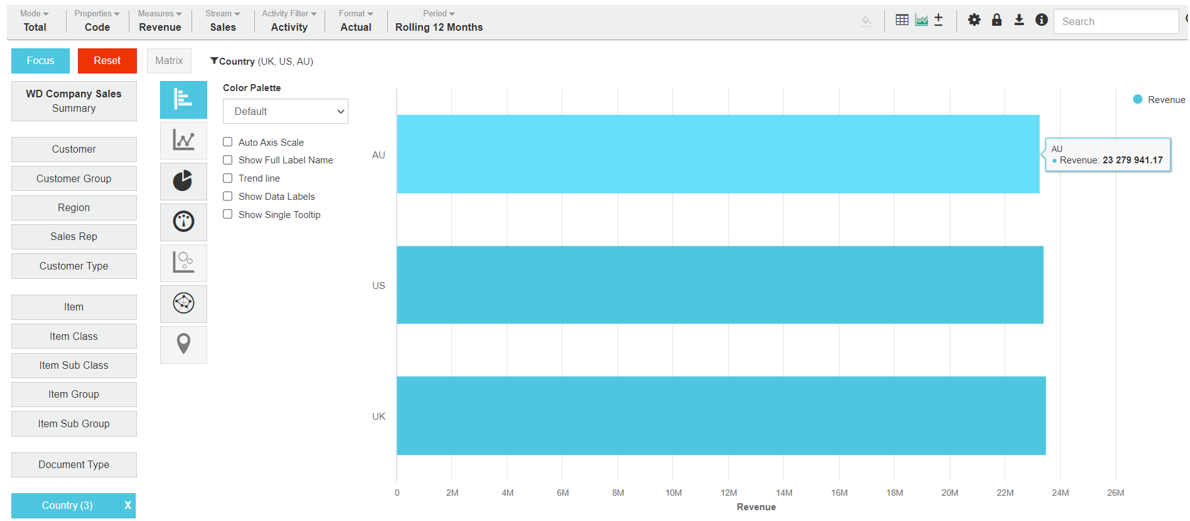
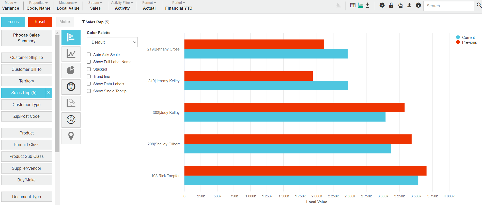
The following table describes what the Bar chart looks like in each view. The Column chart looks similar.
Summary view | Focused view | |
Contents | There are bars for each time unit (month/day/year) in the period (or stream). The current period has a blue bar and the previous period has a red bar. | There is a bar for each of the focused items. |
X-axis | The X-axis displays the total, which starts at zero. | The X-axis displays the total, which starts at zero. |
Y-axis | The Y-axis displays the time units of your current period. | The contents of the Y-axis depends on the mode. In Period and Moving mode, it displays the time units of your current period. Whereas, in Variance, Stream and Total mode, it displays each focused item. |
Example |
Related pages
You can take the following actions with your chart:
Configure the chart options | Select and focus on a chart segment | Use the chart legend | Save the chart as a favorite | Add the chart to a dashboard | Export a chart as an image
See also the main page: Visualize your data in a chart