| Summary view | Focused view | |
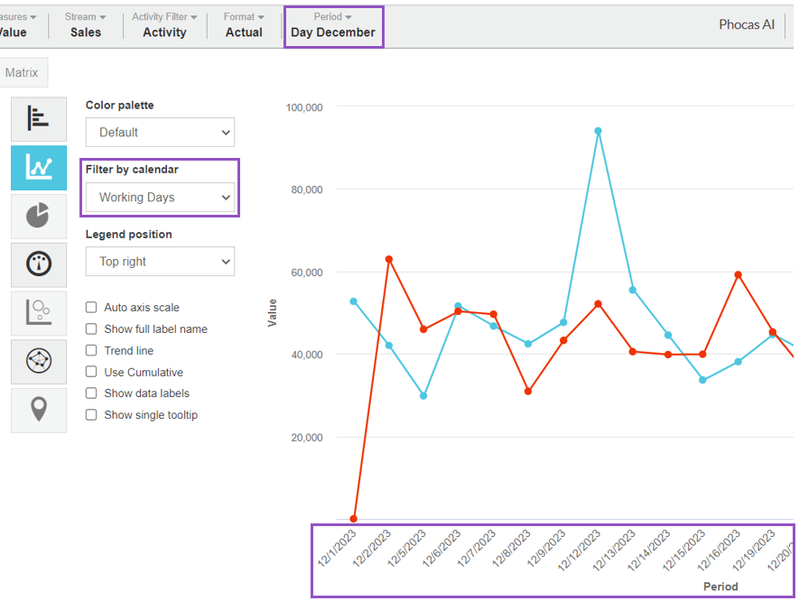
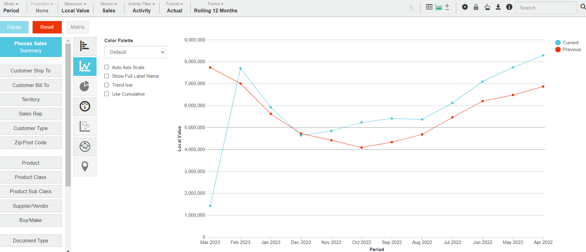
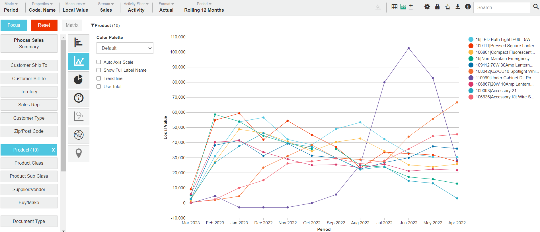
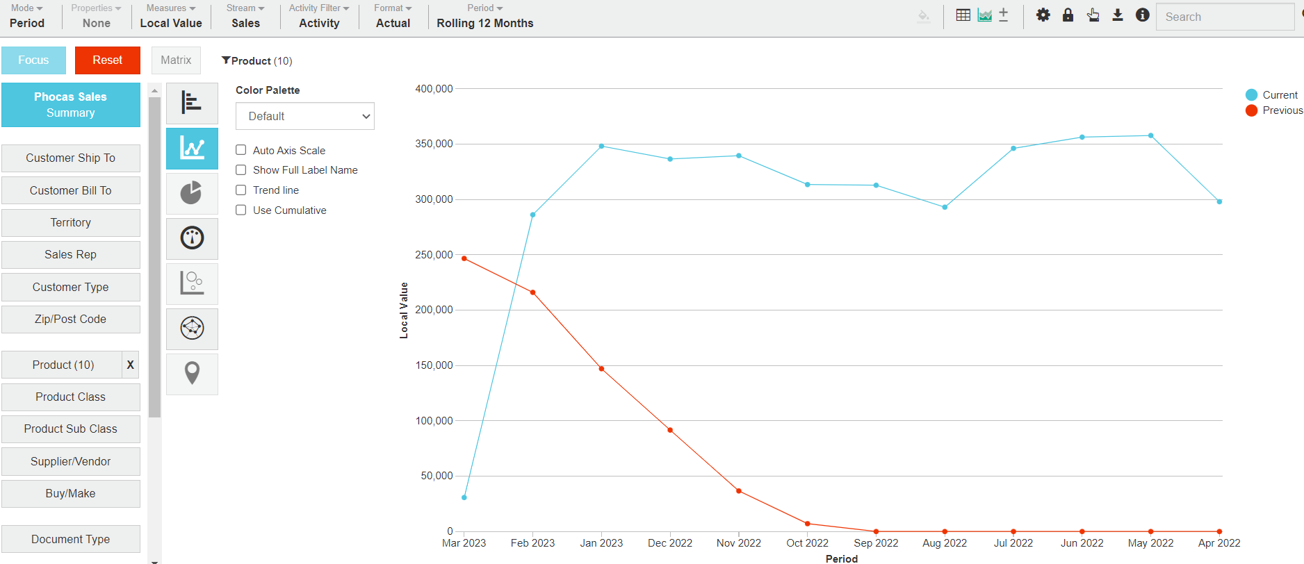
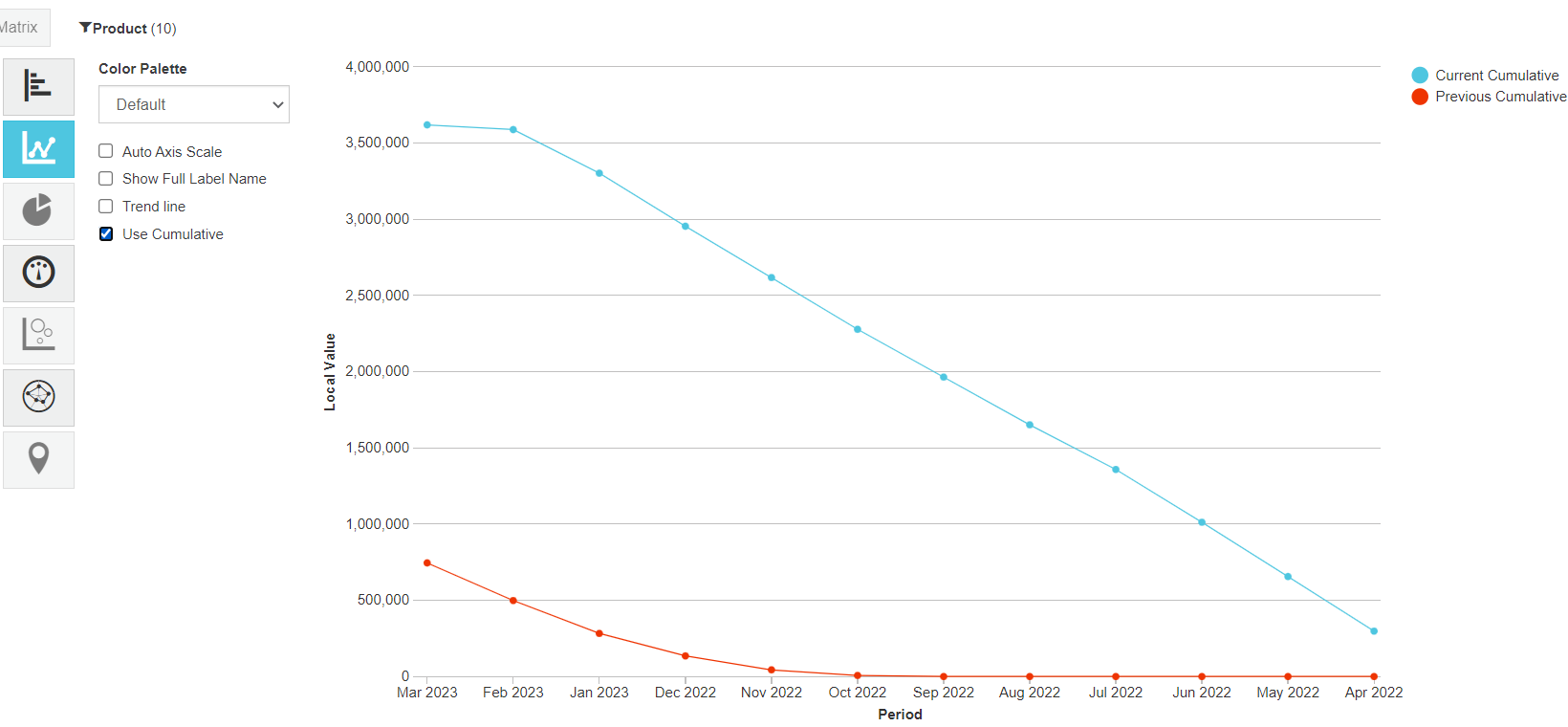
| Contents | There is a blue line for the current period (or stream) and a red line for the previous period (or other stream). | There is a line for each of the focused items. |
| X-axis | The X-axis displays the time units of your current period. | |
| Y-axis | The Y-axis displays the total or value of each measure, which starts at zero. | |
| Example |  |  |
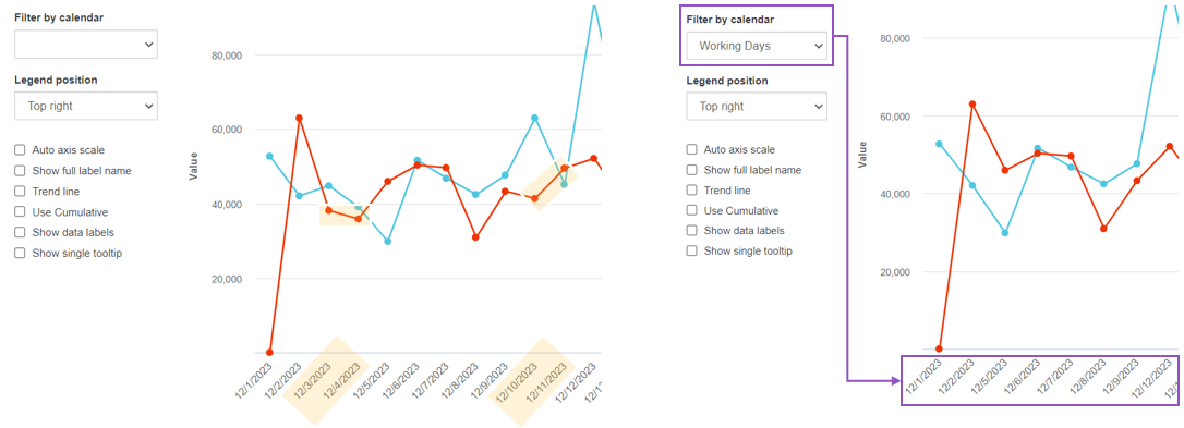
 When you look at the data over a week, you see troughs on Sundays and Mondays where the values are 0 (expected), as illustrated by the highlighted areas in the image on the left below. You might prefer to show only working days (exclude non-working days) in the chart, to more accurately reflect what’s going on. In the image on the right below, you can see the data trend more clearly when Sundays and Mondays are removed from the chart.
 In the Sales database, create a Line chart to compare the revenue earned in December this year compared to December last year.
1. In Period mode, Summary view, select a day type of period from the **Period** menu.
2. Click the **Chart** button in the top right toolbar above the grid.
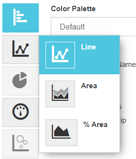
3. Click the **Line** chart category button on the left of the chart and select the **Line** option.
4. Select **Filter by calendar** and select the required calendar, such as **Working Days**, then click out of the box to apply your change. The chart updates to only display data for the working days.
