# Bubble chart
{% hint style="info" %}
Availability:
* Summary view - Period and Total modes only.
* Focused view (when you select and focus on items in a dimension) - Total mode only.
{% endhint %}
A Bubble chart uses color-coded circles (bubbles) plotted on an X and Y-axis to represent [measures](https://docs.phocassoftware.com/analytics/customize-your-view-analytics/change-the-measures-analytics). By default, the first measure displays on the X-axis and the second measure displays on the Y-axis. The third measure, if there is one, determines the size of the bubbles. You can swap the measures around to change what displays on each axis and change the bubble size.
In summary view, the chart displays a bubble for each time unit (month/day/year) in the period, as illustrated in example 2 below.
In a focused view, the chart displays a bubble for each focused item, as illustrated in example 1 below.
Example 1: Compare the margin and value of selected product classes
In the Sales database, create a Bubble chart to visualize the high-margin low-value products, and vice versa. Specifically, you want to chart the Value, Value/Item and Margin measures for items in the Product sub class dimension.
Prepare the data in the grid:
1. Select the **Product Sub Class** dimension, then select and focus on a number of sub-classes.
2. Select **Mode** > **Total**.
3. Specify the first two measures: Select **Measures** > **Local value** and **Local Value/Item**.
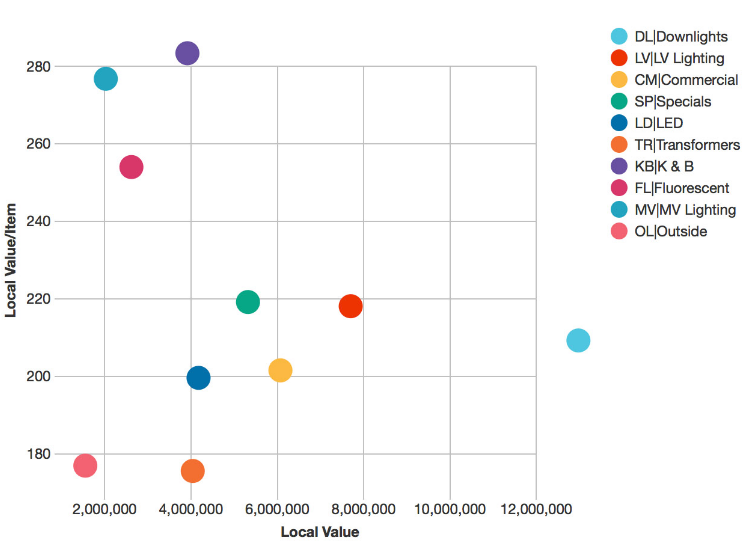
Click the **Chart** button in the top right toolbar above the grid, then click the **Bubble** chart category button on the left of the chart and select the **Bubble** option. The chart displays and all bubbles are the same size.
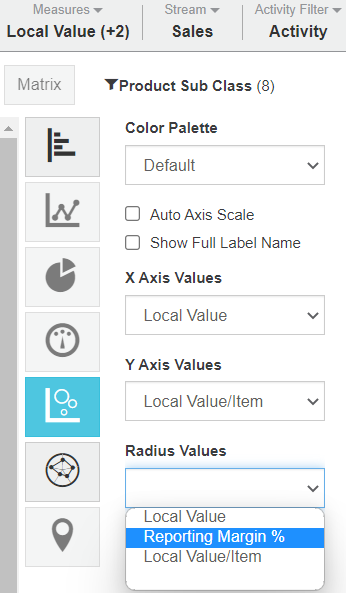
 Add a third measure: From the chart view, select **Measure** > **Reporting Margin %**. The **Reporting Margin %** is now available in the **Radius Values** setting. If it is not automatically selected for you, select it from the list (see image below).
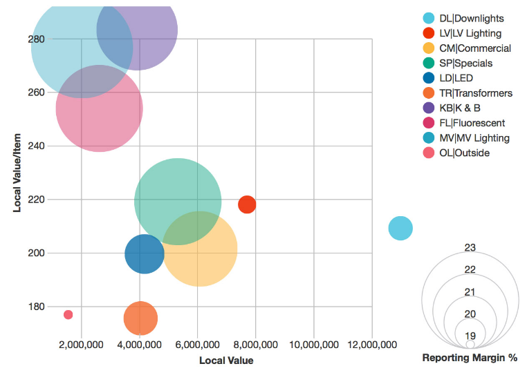
 The bubbles in the chart change size and an extra legend appears on the bottom right to display the relationship between Margin and the bubble size. In this example, you can see that highest value group (Downlights) has a relatively low margin (small circle). The group causing concern is Outside, which has low sales, low value per item and low margin group.

Compare the total performance of product classes
Using the Bubble chart in the above example, click the **Summary** button. The chart updates to display a bubble for each time unit within the selected period, which in this case is Financial YTD and each bubble displays the total performance of the selected product classes for each month so far.

***
{% hint style="success" %}
**Related pages**
You can take the following actions with your chart:
[Configure the chart options](https://docs.phocassoftware.com/analytics/visualize-your-data-in-a-chart/configure-the-chart-options) | [Select and focus on a chart segment](https://docs.phocassoftware.com/analytics/visualize-your-data-in-a-chart/select-and-focus-on-a-chart-segment) | [Use the chart legend](https://docs.phocassoftware.com/analytics/visualize-your-data-in-a-chart/use-the-chart-legend) | Save the chart as a favorite | Add the chart to a dashboard | [Export a chart as an image](https://docs.phocassoftware.com/analytics/visualize-your-data-in-a-chart/export-a-chart-as-an-image)
See also the main page: [Visualize your data in a chart](https://docs.phocassoftware.com/analytics/visualize-your-data-in-a-chart)
{% endhint %}
---
# Agent Instructions: Querying This Documentation
If you need additional information that is not directly available in this page, you can query the documentation dynamically by asking a question.
Perform an HTTP GET request on the current page URL with the `ask` query parameter:
```
GET https://docs.phocassoftware.com/analytics/visualize-your-data-in-a-chart/bubble-chart.md?ask=
```
The question should be specific, self-contained, and written in natural language.
The response will contain a direct answer to the question and relevant excerpts and sources from the documentation.
Use this mechanism when the answer is not explicitly present in the current page, you need clarification or additional context, or you want to retrieve related documentation sections.
 Add a third measure: From the chart view, select **Measure** > **Reporting Margin %**. The **Reporting Margin %** is now available in the **Radius Values** setting. If it is not automatically selected for you, select it from the list (see image below).
 The bubbles in the chart change size and an extra legend appears on the bottom right to display the relationship between Margin and the bubble size. In this example, you can see that highest value group (Downlights) has a relatively low margin (small circle). The group causing concern is Outside, which has low sales, low value per item and low margin group.
